TEMU App Redesign

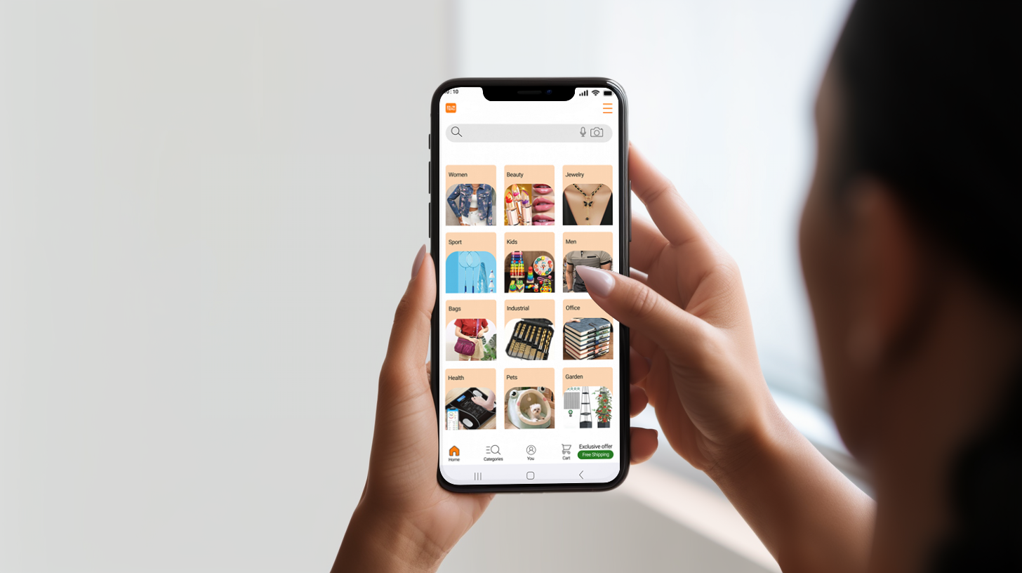
A redesign of the TEMU app focused on improving usability, simplifying navigation, and creating a more efficient and user-friendly shopping experience.

This project is a detailed UI analysis and redesign of the TEMU online shopping app. The goal was to break down the visual and structural elements of the existing interface and propose a cleaner, more intuitive design. The redesign focuses on simplifying the layout, improving navigation, and limiting distracting visual noise to enhance user experience from the moment they open the app.
Problem: TEMU’s current interface overwhelms users with too many colours, densely packed product images, and information overload on the homepage. New users find it difficult to recognize main features and navigate categories because everything is displayed at once without hierarchy, causing confusion and cognitive overload.

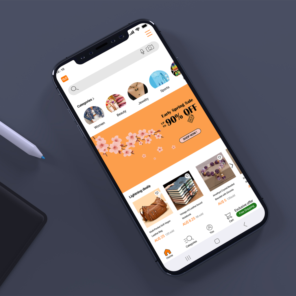
Solution: A cleaner UI was developed with limited colour usage, a stronger focus on search functionality, and improved category organisation. A hamburger menu was introduced to move overcrowded content off the homepage, while the search bar gained new features such as image search and voice input. Cards were redesigned with a clear “Add to Favourite” option, and the sale section was visually simplified to improve clarity.

Project Goals: The objective of the redesign was to create a simpler and more organised shopping experience by improving information hierarchy and navigation structure. The goal was to help users quickly find what they are looking for without being distracted by unnecessary visual elements, ultimately reducing frustration and making product discovery seamless.